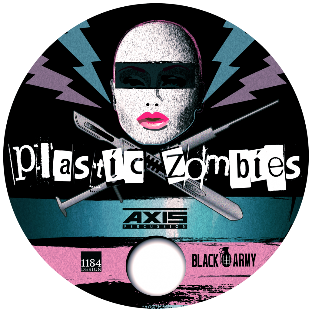
drum art for band

Drum Art for Plastic Zombies

Much of my work is for businesses, and therefore ‘clean and corporate’ — but that just wouldn’t have fit the bill for this punk-influenced band local to Southern California. While the overall artwork did need to go with the turquoise finish of one of the band’s drums, there were no other rules: befitting the punk influence at the heart of their music, band members were fine with either amusing or offending potential audiences.

Check back soon: when I have a link to their schedule, I’ll be happy to post it!


Split Types

Sigh. . . it’s always unfortunate when partners break up. We were saddened to hear about the Hoeffler Frere-Jones split. At this point, it looks like the case will grind through State of New York courts for some time to come.

Read more Split Types

Shovel in Style

(Click the title above to read more, then click the back button on your browser to come back!)

Don’t take this one too seriously: we’re just avoiding that nasty east coast weather and having a little fun with color! Dante will shovel your sidewalk . . right after @Chirlane is satisfied that their sidewalk is clear. (just kidding!) He’s wielding a brand new shovel, featuring Pantone’s 2014 Color of the Year — Radiant Orchid.

Most Inappropriate Use of Comic Sans Ever!

Many of us consider the use of Comic Sans to be inappropriate for any use, anytime, anyplace. However, it’s hard to top this one: a war memorial in Geffen, Netherlands. Not kidding! The choice generated some controversy, and the town responded on its official website (Google translation below):

On Saturday, October 20 was the unveiling of the monument ‘Reconciliation’. Questions have arisen about the choice of the font Comic Sans.

The reason for choosing this font is practical. The Working Group, in consultation with the sculptor chose a slightly rounder and thicker font to use that form fits well with the stone and is readable from a distance.

Priest at war memorial unveiling in Netherlands

Source: http://www.spitsniews.nl  Photo: ANP
No amount of priestly blessing can save this unfortunate typography choice!


Source: http://www.spitsniews.nl  Photo: ANP
These folks seem as stunned about the choice of Comic Sans for a war memorial as I was…

Okay, no criticism without a suggestion for improvement. Too late to undo the unveiling of this stone, and it was a missed opportunity to feature the work of a Dutch typeface designer. I nominate M.O.L. by Gerard Unger as a “slightly rounder and thicker font…that is readable from a distance.” See an example here, in use for subway signage in Amsterdam. The Linotype foundry website includes a sample image of characters included in the M.O.L. typeface on their profile page for Mr. Unger.

The typeface foundry for Comic Sans? That would be Microsoft, or specifically Vincent Connare. He claims that the design was not intended to be a typeface at all, but simply for use in those familiar speech balloons seen in comic strips (and in some computer applications intended for children). Read his explanation at: connare.com.