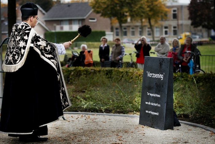
Many of us consider the use of Comic Sans to be inappropriate for any use, anytime, anyplace. However, it’s hard to top this one: a war memorial in Geffen, Netherlands. Not kidding! The choice generated some controversy, and the town responded on its official website (Google translation below):
On Saturday, October 20 was the unveiling of the monument ‘Reconciliation’. Questions have arisen about the choice of the font Comic Sans.
The reason for choosing this font is practical. The Working Group, in consultation with the sculptor chose a slightly rounder and thicker font to use that form fits well with the stone and is readable from a distance.
Source: http://www.spitsniews.nl Photo: ANP
No amount of priestly blessing can save this unfortunate typography choice!
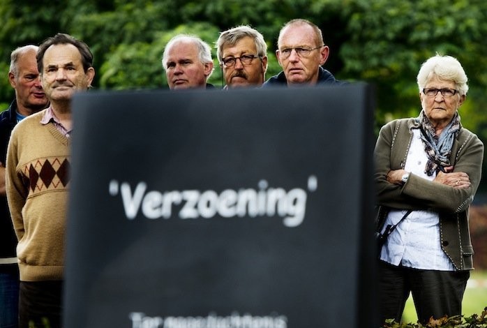
Source: http://www.spitsniews.nl Photo: ANP
These folks seem as stunned about the choice of Comic Sans for a war memorial as I was…
Okay, no criticism without a suggestion for improvement. Too late to undo the unveiling of this stone, and it was a missed opportunity to feature the work of a Dutch typeface designer. I nominate M.O.L. by Gerard Unger as a “slightly rounder and thicker font…that is readable from a distance.” See an example here, in use for subway signage in Amsterdam. The Linotype foundry website includes a sample image of characters included in the M.O.L. typeface on their profile page for Mr. Unger.
The typeface foundry for Comic Sans? That would be Microsoft, or specifically Vincent Connare. He claims that the design was not intended to be a typeface at all, but simply for use in those familiar speech balloons seen in comic strips (and in some computer applications intended for children). Read his explanation at: connare.com.


