Infographics and Analytics

Analytics seem to be in use for every area of life these days. Chances are your business is making use of data analysis everyday, but how do you communicate to your customers what matters about the data?

Maybe we’re biased, but we’ve observed that images, especially infographics that relate to your company’s business, is a great way to explain “what it all means” once you have the data. Visual information makes it easier for your viewers to grasp the analysis of your data in a way that is meaningful to them.

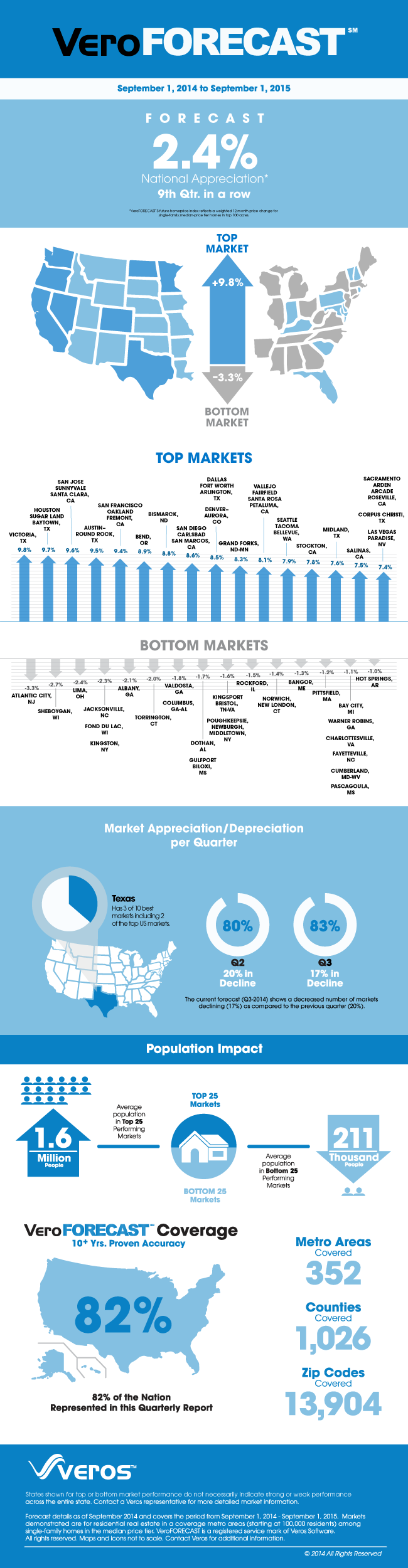
We recently had the chance to develop an infographic for Veros — a real estate analytics firm. The big story was that the top markets were all west of the Mississippi and the bottom markets seemed to be east. The client wanted quite a bit of data about specific markets, so our challenge was to organize that in a manner that still allowed a viewer to get the big picture at a glance.

Tips for creating infographics:

  • Pie charts are best to compare percentages to the whole, and for categories that are less than 5% of the total, it may be best to group as “Other”.
  • Line charts can effectively show fluctuations over time
  • Yes, you can combine more than one type of chart in an infographic; the rule is to keep thing visually simple so the most important facts can be understood in a glance.

Here’s the infographic:

2014 Q3 VeroFORECAST Infographic

Save

drum art for band

Drum Art for Plastic Zombies

Much of my work is for businesses, and therefore ‘clean and corporate’ — but that just wouldn’t have fit the bill for this punk-influenced band local to Southern California. While the overall artwork did need to go with the turquoise finish of one of the band’s drums, there were no other rules: befitting the punk influence at the heart of their music, band members were fine with either amusing or offending potential audiences.

Check back soon: when I have a link to their schedule, I’ll be happy to post it!


Happy Holiday!

My favorite canine hits the road, and more…apparently.

This illustration was done in Illustrator, with the canine photo masked in Photoshop and then dropped into the composition.

Typeface for whimsical title was FontDiner’s Loungy. They’re a type foundry that specializes in retro fonts. (Loungy is listed under Free Silverware)

Every Picture Tells A Story

Every picture tells a story; I just don’t know what the story behind this one happens to be.

Could it be that the owner of these boots was loading items in a car, then heard his phone ring inside the vehicle, took the call, and forgot to finish loading the last item? . . . or maybe it’s something more interesting.

You’re invited to create a back story to these photos! Add a comment or send a tweet to @1184design.


Window Seat — Illustration for children’s book

Illo Competition

Did you know about 3×3 magazine? If not, it’s a go-to place for finding illustration resources online. You’ll find eye-catching illustrations there, with a broad variety of styles for any type of project requirement!

Each year, 3×3 publishes Illo, a collection of the best illustration for print. The book features a variety of categories of illustration — from advertising, to editorial, children’s, and conceptual.

Read more Illo Competition

Split Types

Sigh. . . it’s always unfortunate when partners break up. We were saddened to hear about the Hoeffler Frere-Jones split. At this point, it looks like the case will grind through State of New York courts for some time to come.

Read more Split Types

Shovel in Style

(Click the title above to read more, then click the back button on your browser to come back!)

Don’t take this one too seriously: we’re just avoiding that nasty east coast weather and having a little fun with color! Dante will shovel your sidewalk . . right after @Chirlane is satisfied that their sidewalk is clear. (just kidding!) He’s wielding a brand new shovel, featuring Pantone’s 2014 Color of the Year — Radiant Orchid.